written by Lisa Paige-Pretorius
When you look outside, life’s colors are bright and vibrant, or dark and dwindling as the day ends or the seasons change. Sunlight and bright green leaves tell you Spring is right around the corner, which prompts every walker/jogger/distance runner to lace up and get out there, right? Color affects so many aspects of our daily lives, influencing the mood, excitement level, and direction for your day – all in an instant as your eyes open. The color of the environments in which we work and live also sets the stage for how each moment will flow through to the next. Trends and fads change every year whether you notice the shift or not, with color playing a major role. How then, can the design consultant integrate color into the design of the foodservice facility?
 Color – The Eye’s Feast
When you go into a restaurant – what’s the first thing you notice? The layout? The lighting? The other customers? …. or is it the color and feel of the space? I bet subconsciously you aren’t thinking about color theory and the deep psychology of the exact shade of green or off-white on the wall and what it all means, but you know how it makes you feel…. So, let’s take a second to dig in:
What is Color Theory?
Color theory is the general application of color principles to design. It involves different types of additive and subtractive color systems that define a palette of colors to be used online, digitally, or in print.
Since there are infinite color combinations out there, it can be hard to decide what color scheme will work the best for your space. Fortunately, we have color theory, a discipline that helps us select balanced and effective color combinations.
Age and Color
Age also plays a role in color preferences. Faber Birren, the author of Color Psychology And Color Therapy, found that young people tend to prefer colors with longer wavelengths (such as red and orange), while older people like colors with shorter wavelengths (such as blue). Joe Hallock’s same study on gender and color preferences confirmed Birren’s findings, but also found that many age groups prefer purple.
 The Application of Color
Think about what you immediately perceive when looking at the interior of a restaurant… what’s on the menu? are the patrons hip and young, or older and polished? Price point of the meals? An instant “We have to go there tomorrow!” Is it a new hot, trendy spot or a special night just for the two of you?
Over the past 30 years (yikes, I’m feeling old for my 25 years!!) in the foodservice industry as a teenage worker, patron, and designer, I’ve designed more than a few restaurants, corporate serveries, university, and medical facilities from concept design to completion, and the one aspect that keeps my eye sharp is the color. Color is used to entice customers to come inside, experience and enjoy, hopefully bringing you back for more. Is it fresh and new, dated and old, or meant for children or seniors? Color can help express that instantly – think 1950-1960’s home kitchens (were the stove & refrigerator yellow, green, or orange at your family’s house?)
Expressionistic Color
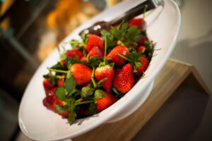
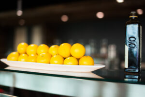
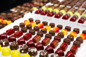
The menu can also be expressed when you see the color of a beautiful dining room. At the hands of the chef, the ingredients- – – the spices, vegetables, meats, and sauces all come together to create a feast for your eyes. Bright red, gold, and green tomatoes, yellow cheese, blueberries, deep green cucumbers, and brown crusty bread. Did you see the toss from the bowl into the air of your mixed greens salad? I bet it caught your eye.
How can we apply our knowledge of color theory to the kitchen itself? Commercial kitchens are fairly limited on finishes, (due to health & safety standards for non-porous and bleach-cleanable surfaces – i.e. stainless steel everywhere) so they tend to be a bit colorless and monotone.
How then do we integrate color with function and expression? One of the best design decisions made is when an establishment opens the heart of the kitchen to you via open kitchen design.
Open Kitchens
An open kitchen is just that – a cooking environment open to view that entices the senses of the customer through sight, smell, and movement. The visual appeal of an open kitchen is where the skill and talent, along with the flames, creates a medley of color that excites and invigorates you the guest, client, or observer.
 In designing an open kitchen, the biggest feature you want to showcase should be a) the food by way of a consistency of color cohesion with the rest of the dining room or b) you can choose a true accent piece to pop the rest of the space. For example, if the seat coverings, smallwares, and wall art all have a common color element, it helps pull the whole space together to create continuity. The color of the food should be a feast for your eyes and taste oh so vibrant in this establishment.
Or do you want to feature a pop of color to draw your eye to a certain element? Then let’s Celebrate it and look for the burst to happen on your palate! Imagine for a moment entering an establishment where a simple use of a single color draws the eye to the bright yellow exhaust hood and ties it to the bright yellow countertop edge. The rest of the space is black and white with blue dishes. Did you notice the dishes were blue – or just saw the yellow of the hood? Your attention and eyes are drawn to the main focus and just below as you watch and wait for your meal to be presented right off the grill, still sizzling and delicious – the main dish.
What’s for Dinner?
“What’s for dinner?” has to be the most asked question – ever! The color of food and the environment it’s served in can and will forever-more make it taste so much better (than boring grey and white). Viva La Color Revolution! Enjoy those veggies, spicy dishes, and “everything and the kitchen sink”-topped salads! Enjoy all of the moments you have together with the special people in your life over a colorful and nourishing meal.
Lisa Paige-Pretorius is project manager at Cini-Little International, Inc., Charlotte, N.C. This article appears courtesy of Cini-Little.